Role: Brand Designer
Problem:
Launched by Pine Labs in October 2021, Plural provides online payment solutions for businesses, including a payment gateway, Affordability Suite, payment links, and subscription solutions. Initially, Plural operated as a distinct business unit under the Pine Labs umbrella, utilizing a colour palette that diverged significantly from the parent brand. This disconnect led to confusion and loss of brand ownership, with the visual language not aligning with Pine Labs’ identity.
Launched by Pine Labs in October 2021, Plural provides online payment solutions for businesses, including a payment gateway, Affordability Suite, payment links, and subscription solutions. Initially, Plural operated as a distinct business unit under the Pine Labs umbrella, utilizing a colour palette that diverged significantly from the parent brand. This disconnect led to confusion and loss of brand ownership, with the visual language not aligning with Pine Labs’ identity.
Moreover, Plural wanted to break away from the standard, basic visual language commonly seen in the B2B sector. They aspired to make a bold statement, positioning themselves as a young, energetic player in the space, signalling their fresh approach and dynamic outlook. The main challenge was to realign Plural's branding with Pine Labs while maintaining this sense of energy and distinctiveness.
Solution:
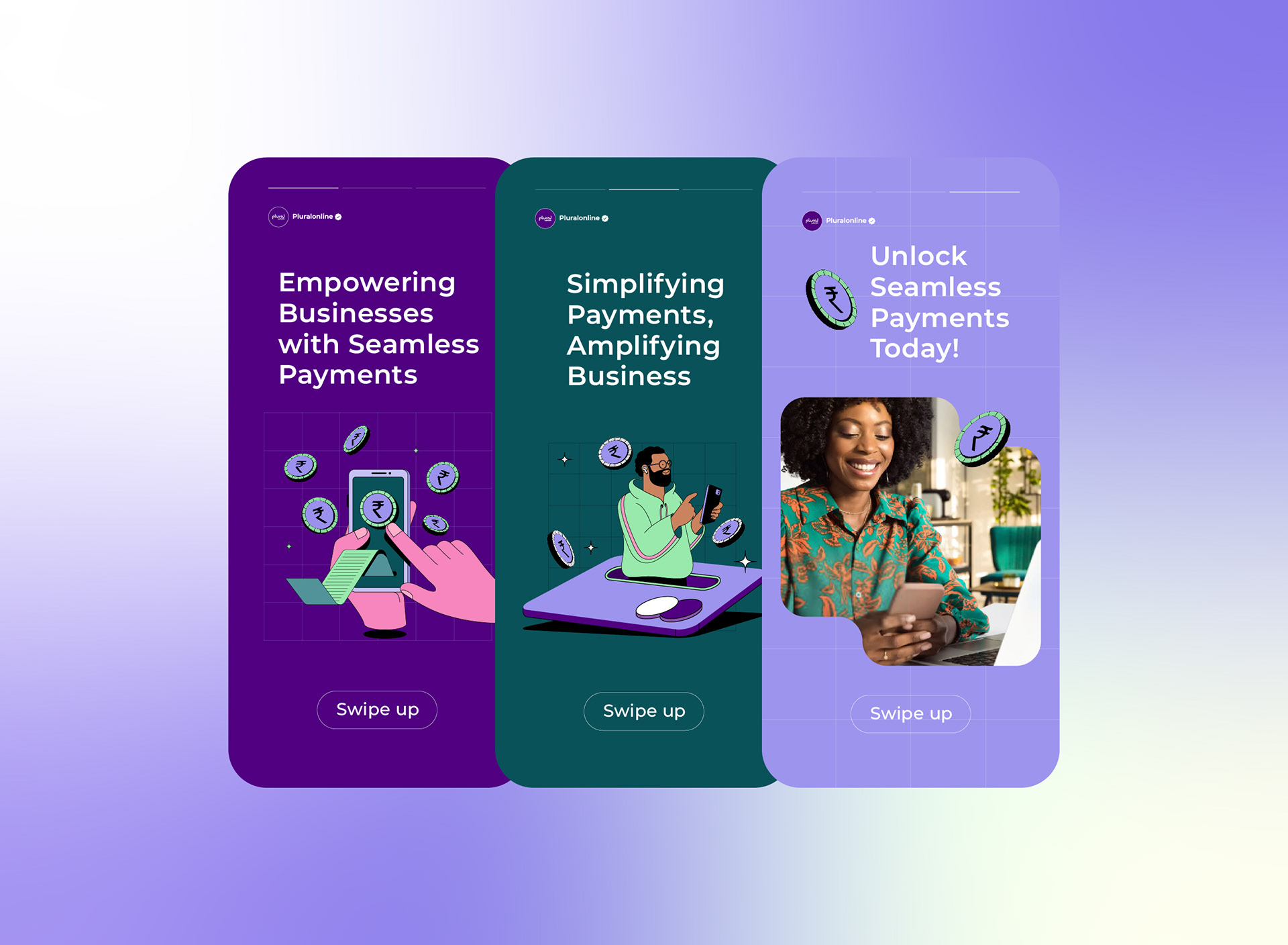
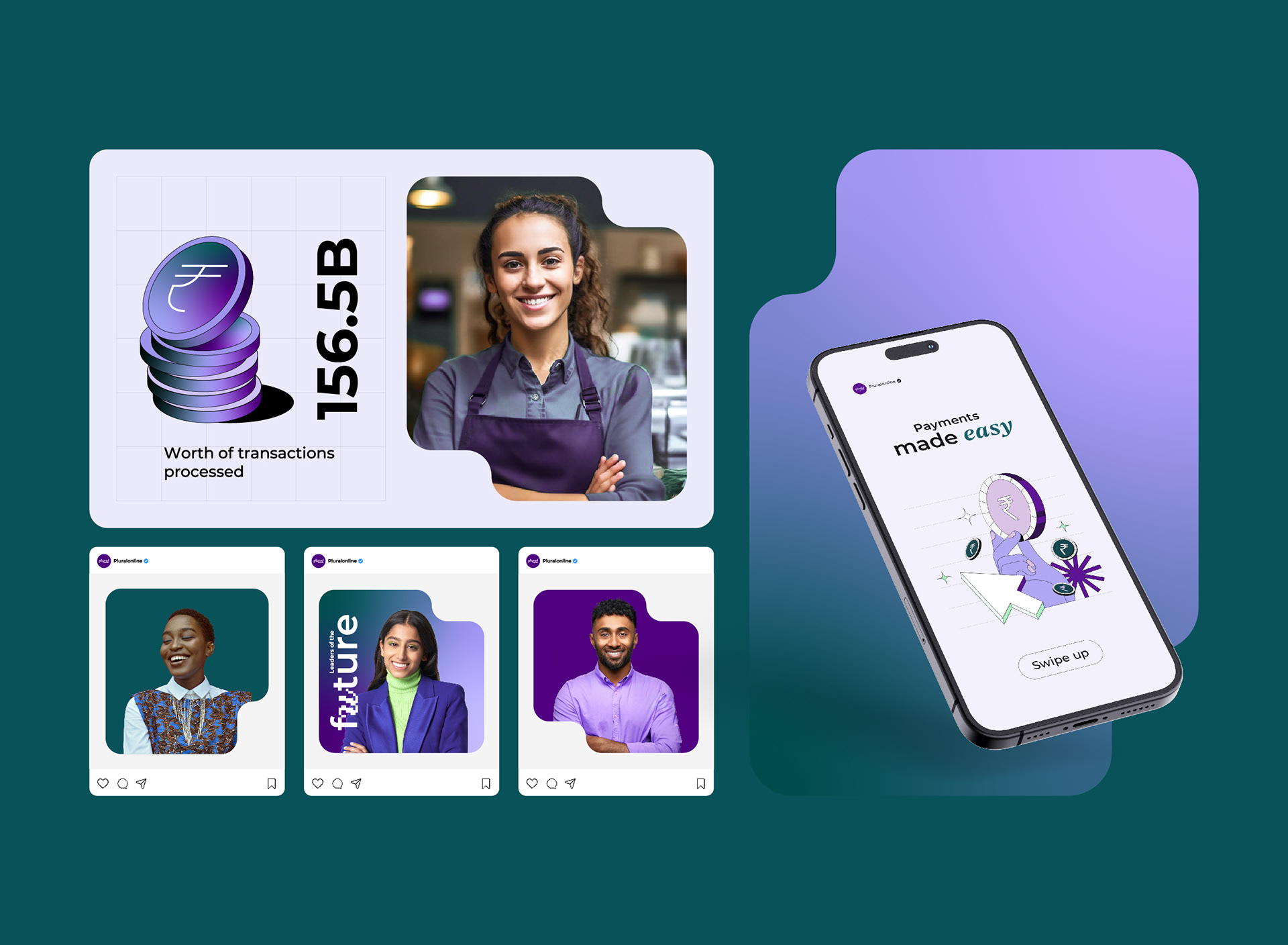
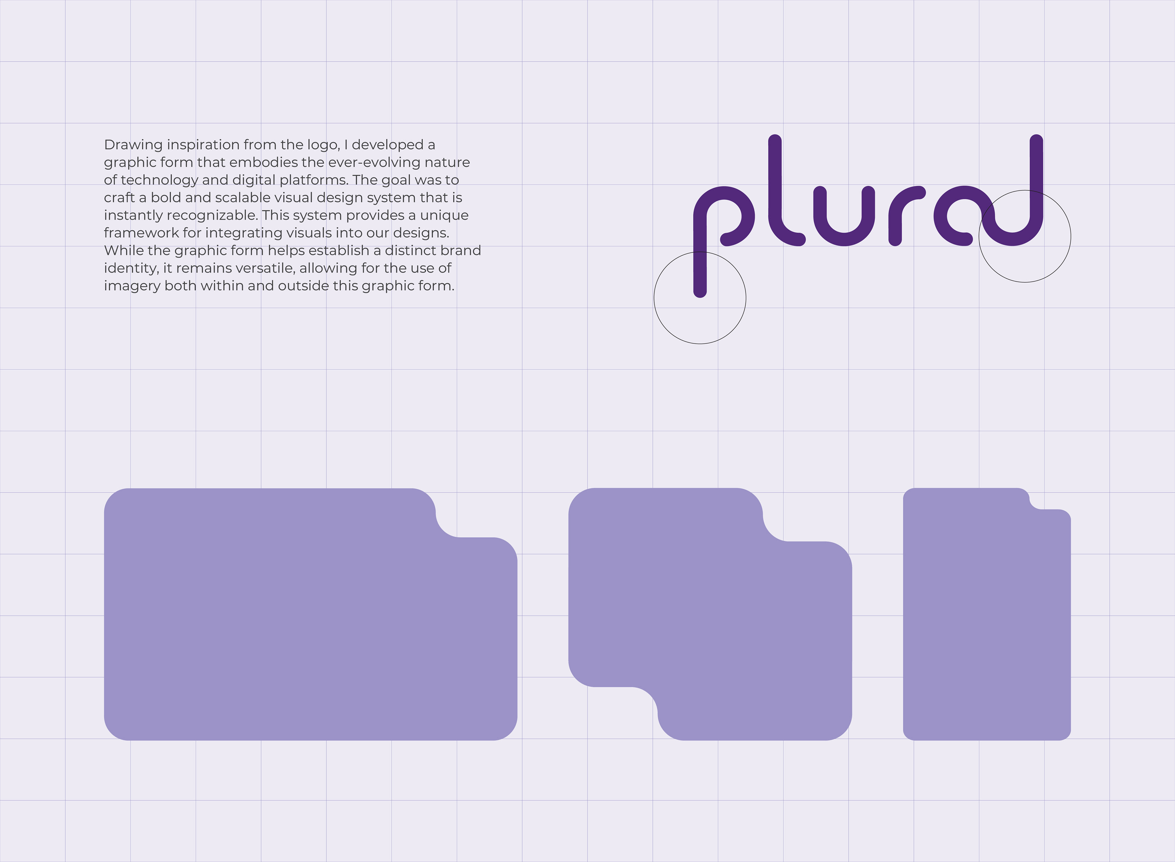
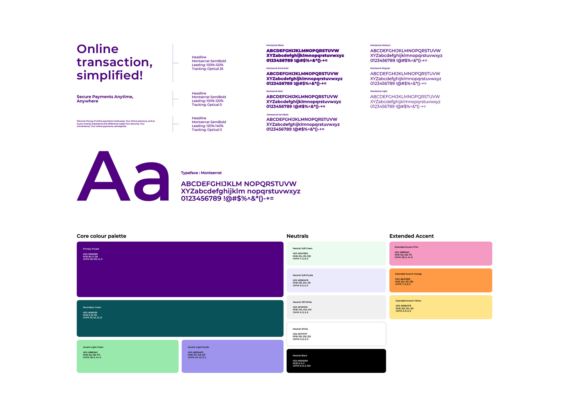
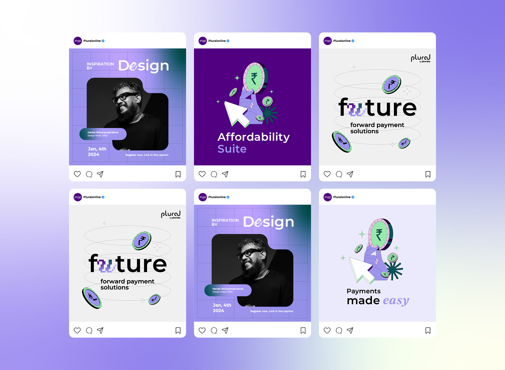
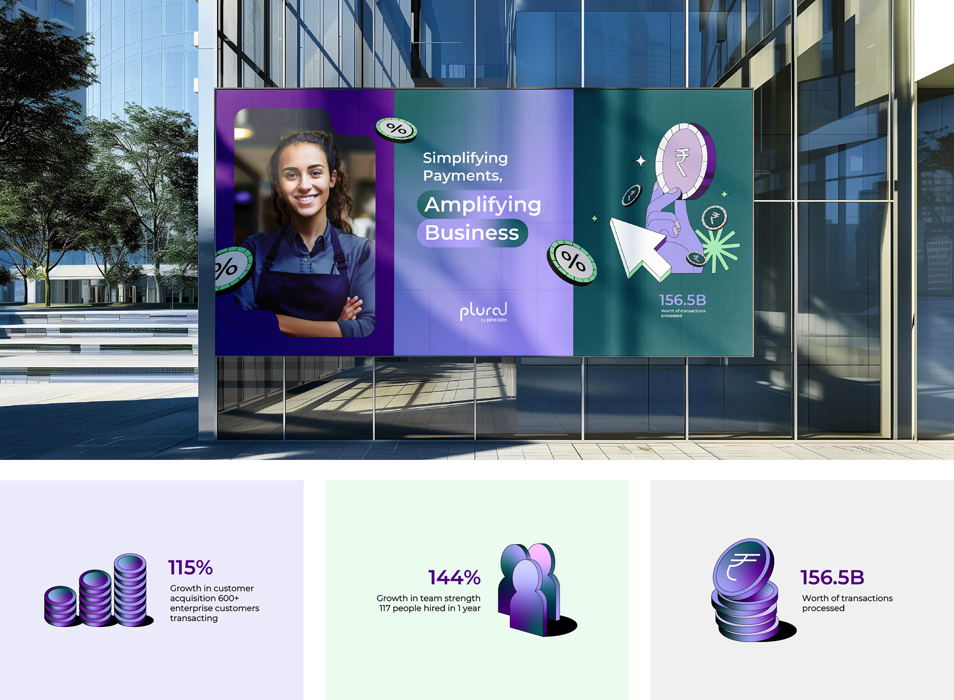
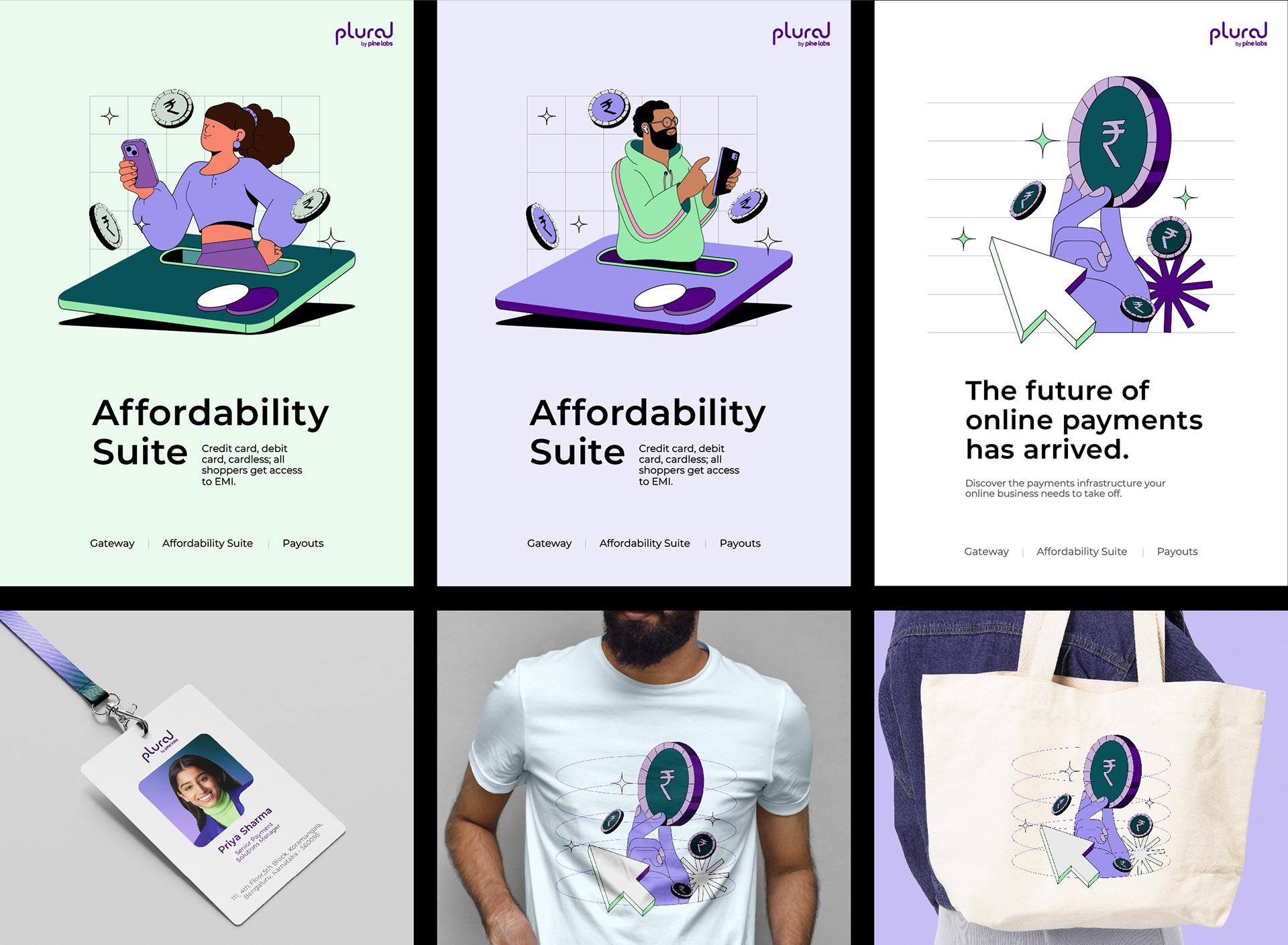
Working closely with both the business and design teams at Plural, I led the visual refresh to not only bring Plural's identity in line with Pine Labs but also reflect their youthful, energetic spirit. This involved introducing a vibrant colour palette more aligned with Pine Labs’ visuals, but with a bold twist to stand out. I also refreshed typography, illustrations, templates, and iconography to create a design language that was modern, expressive, and full of energy. This allowed Plural to differentiate itself in the B2B sector while staying true to its tech-heavy core and brand vision.
Working closely with both the business and design teams at Plural, I led the visual refresh to not only bring Plural's identity in line with Pine Labs but also reflect their youthful, energetic spirit. This involved introducing a vibrant colour palette more aligned with Pine Labs’ visuals, but with a bold twist to stand out. I also refreshed typography, illustrations, templates, and iconography to create a design language that was modern, expressive, and full of energy. This allowed Plural to differentiate itself in the B2B sector while staying true to its tech-heavy core and brand vision.